 02191008210

مهندسين مشاور اثر پويش پارس
Map
The Widgetkit Map provides a simple solution for adding a map to your website. Various features let you customize the map like changing colors and adding markers or directions.
Features
- Location selection with auto geocoding
- Support for multiple map markers with text popups
- Option to get the direction to the active marker
- Support for custom map styles and colors
- Uses the latest Google Maps API
- Built with HTML5, CSS3, PHP 5.2+, and the latest jQuery version
- Works with Joomla and WordPress
Direction Example
This map features all map controls, multiple markers and you can get the direction.
Color Scheme Example
Set or invert the hue, saturation, lightness and gamma of a map.
Minimal Example
This map has a fixed width, no controls and no markers.
How To Use
With the Widgetkit Map you can quickly create and manage simple maps with features like multiple markers, text popups and custom color schemes. Once you have created a map you can load it anywhere on your website using shortcodes or the universal Widgetkit Joomla module or WordPress widget.
The Widgetkit Twitter module is the neatest way to display tweets directly on your website. All displayed tweets get cached so they show up super fast, even if Twitter is not available.
Features
- Filter tweets by hashtags, words, from users, to users, referencing users
- Block tweets using a blacklist
- Tweets are cached for high performance
- Tweets show up even if Twitter is not available
- 3 different styles to show your tweets
- Responsive design to fit all device resolutions
- Built with HTML5 using article and time elements
- Works with Joomla and WordPress
How To Use
Create a Twitter module in Joomla or a Twitter widget in WordPress and publish it in a module position. A lot of options are available to choose which tweets you want to show.
For example you can show only tweets from a specific user or tweets that contain a certain hash-tag or a specific word. All options can be combined. To filter by more than one word or user use a space between them. For example: yootheme joomla.
Spotlight
The Widgetkit Spotlight allows you to add an overlay to your images which fades or moves in on mouse hover. The overlay can be an image or HTML content. The default magnifier spotlight is a perfect match to be used with a lightbox.
Features
- Create nicely animated image overlays
- Supports custom image or HTML content overlays
- 5 different animation modes
- Responsive design to fit all device resolutions
- Built with the latest jQuery version
- Works with Joomla and WordPress
Examples
If no custom overlay is set the default spotlight fades in an overlay with an magnifier image. If you define a custom overlay you can choose between different animations - fade, bottom, top, right and left.
How To Use
Use the HTML5 custom data attribute data-spotlight to activate the spotlight.
<a data-spotlight="on" href="/mypage.html">
	<img src="/image.jpg" width="180" height="120" alt="" />
</a>
To create a custom overlay use a div element with the CSS class overlay. You can set the effect parameter to the data attribute. For example:
<a data-spotlight="effect:bottom;" href="/mypage.html">
	<img src="/image.jpg" width="180" height="120" alt="" />
	<div class="overlay">Custom Overlay</div>
</a>
You can set the effect parameter to fade, bottom, top, right and left.
Lightbox
The Widgetkit Lightbox allows you to view images, HTML and multi-media content on a dark dimmed overlay without having to leave the current page.
Features
- Display images, videos, HTML, Iframes, Ajax requests and SWF
- Supports YouTube, Vimeo, MP4 (h.264), WebM and FLV movies
- Group lightboxes and mix different content types
- Responsive design to fit all device resolutions
- Load other widgets in lightbox
- 3 different opening and closing transitions
- 4 different caption styles
- Keyboard and mouse scroll wheel navigation
- Build on the latest jQuery version
- Works with Joomla and WordPress
Examples
Different animations - fade, elastic and none


Different title positions - float, inside and over


Various examples in one gallery (try also using the keyboard and mouse scroll wheel)
Load Widgets In A Lightbox
Use #wk-ID to load widgets like slideshows or galleries in a lightbox. For example: Widgetkit Slideshow
<a data-lightbox="width:600;height:300;" href="#wk-10">Lightbox</a>
How To Use
Use the HTML5 custom data attribute data-lightbox to activate the lightbox. You can set various lightbox parameters to the data attribute. For example:
<a data-lightbox="width:1000;height:600;" href="http://www.wikipedia.org">Lightbox</a>
Here is a list of the most common parameters:
- titlePosition - How should the title show up? (
float,outside,insideorover) - transitionIn - Set a opening transition. (
fade,elastic, ornone) - transitionOut - Set a closing transition (
fade,elastic, ornone) - overlayShow - Set to
trueorfalse - scrolling - Set to
yesorno - width - Set a width in pixel
- height - Set a height in pixel
- padding - Set a padding in pixel
Slideshow
The Widgetkit Slideshow is the ultimate image and content slideshow for Joomla and WordPress. It's flexible, easy to customize and completely build with HTML5 and CSS3.
Features
- Clean and very lightweight code
- 17 eye-catching transition effects
- Fully responsive including all effects
- Uses hardware accelerated CSS3 animations
- Support for HTML captions
- Swipe navigation on mobile phones
- Built with HTML5, CSS3, PHP 5.2+, and the latest jQuery version
- Works with Joomla and WordPress
Slideshow Screen Example
This is an image slideshow with the famous Ken Burns effect.
Slideshow Default Example
This is an image slideshow with eye-catching transition effects.
Showcase Box Example
This a content showcase using all the features from the Slideset widget as navigation. Any kind of HTML content can be used in the navigation.
Showcase Button Example
This is an image slideshow with some nice navigation buttons. You can place any kind of HTML in the navigation buttons.
Tabs Example
This is a classic, tabbed slideshow. Tabs can be aligned to the left, right and center.
Tabs Bar Example
This is a slideshow with a tabbed navigation bar. Tabs can be aligned to the left, right and center.
List Example
This is a slideshow with a vertical tabbed list as navigation.
How To Use
The Widgetkit Slideshow takes full advantage of the very user-friendly Widgetkit administration user interface. It has never been easier to create and manage all the slideshows and their different slides in one place. After you created a slideshow you can load it anywhere in your theme using shortcodes or the universal Widgetkit Joomla module or WordPress widget.
صفحه اصلی
اين مهندسين مشاور با تلفيق تجربه مديران ديروز ومهندسان فردا در سال 1389 بنيانگذاري گرديد
و فعاليت هاي خود را در زمينه طراحي و نظارت در چهار گرايش معماري، محاسبات، تاسيسات برقي و مكانيكي پروژه هاي ساختماني و صنعتي آغاز نمود. تسلط كامل بر آخرین ضوابط شهرسازی و مقررات ساخت و ساز، توان طراحی معماری، محاسباتی و اجرای کامل پروژه ها ، بهره گیری از امکانات روز مهندسی ساختمان، همراه با بکارگیری اصول نوین مدیریت سازمان ، آموزش های مستمر پرسنلی و پیگیری مسئولانه امور مشتریان، توانسته است جایگاهی مطمئن و قابل اطمینان نزد كارفرمايان برای این شرکت به ارمغان آورد و هم اكنون اين مجموعه قصد دارد با تكيه بر تجارب ارزشمند كاركنان متخصص و مديريت منسجم به يكي از بزرگترين و قابل اعتمادترينها در كشور و نيز شركتي پيشرو در سطح بينالمللي به ويژه خاور ميانه و كشورهاي منطقه، تبديل شود.
Features
This theme utilizes the latest features of the fast and slick Warp theme framework. It comes with a broad range of layout and module variations as well as a neat typography to style your content. Read on to learn more about this theme and its features:
- Available for Joomla and WordPress
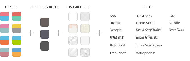
- 8 style variations available
- Choose from 8 colors, 3 secondary colors and 10 fonts
- 4 module style combinable with 4 badges and 6 icons
- Custom widgetkit styles for slideshow and slideset
- Flexible template and column widths
- Fancy rotate effect for the slideshow
- All Warp framework features are available
Theme Styles
We provide different style variations of the default theme. In addition to these styles we added several other style settings like colors and fonts. Combining the different style options allows you to create your own unique theme design.
Theme Profiles
We created some nice theme profiles using the different styles, colors and fonts, you can choose from in the theme administration. You can create your own profiles and even assign them to different menu items. Click on one of the profile images to load it.


Theme Layout
This theme comes with the default Warp6 module layout. The blue module positions allow to choose a module layout which defines the module alignment and proportions: equal, double or stack. You can easily add your own module layouts. The two available sidebars, highlighted in red, can be switched to the left or right side and their widths can easily be set in the theme administration. For modules in the blue and red positions you can choose different module styles. Take a look at the module variations page to get an overview.


Special Features
Custom Widgetkit Styles
We created some custom styles for our Widgetkit Slideshow and Widgetkit Slideset, perfectly fitting to the theme. To apply this styles, follow these steps:
Slideshow
- Download and unzip the bonus styles package for Widgetkit available in the download area
- Copy the folder slideshow/styles/micasa
- Joomla: Paste it to media/widgetkit/widgets/slideshow/styles
WordPress: Paste it to wp-content/plugins/widgetkit/widgets/slideshow/styles - Now you can select the style"MiCasa" in the settings of your Widgetkit Slideshow
Slideset
- Download and unzip the bonus styles package for Widgetkit available in the download area
- Copy the folder slideset/styles/micasa
- Joomla: Paste it to media/widgetkit/widgets/slideset/styles
WordPress: Paste it to wp-content/plugins/widgetkit/widgets/slideset/styles - Now you can select the style"MiCasa" in the settings of your Widgetkit Slideset
Additional Icons
We have also added additional icons, which are part of our editable Adobe Fireworks Image Source Files.
You can easily add them by using following code:
<ul class="footer-icons">
  <li class="location">Location</li>
  <li class="phone">Phone</li>
</ul>
Social Icons
As a little extra, the MiCasa theme offers a set of social icons. They are easy to add to your content and are part of our editable Adobe Fireworks Image Source Files.
You can easily add them by using following code:
<div class="grid-block grid-gutter">
  <div class="grid-box width25">
    <a class="social-icons twitter" href="#"></a>
  </div>
  <div class="grid-box width25">
    <a class="social-icons facebook" href="#"></a>
  </div>
  <div class="grid-box width25">
    <a class="social-icons googleplus" href="#"></a>
  </div>
  <div class="grid-box width25">
    <a class="social-icons rss" href="#"></a>
  </div>
</div>
Possible class names are twitter, facebook, googleplus and rss. Widgetkit

Lorem ipsum dolor sit amet, consectetur adipisicing elit, sed do eiusmod tempor incididunt ut labore et dolore magna aliqua. Ut enim ad minim veniam, quis nostrud exercitation ullamco laboris nisi ut aliquip ex ea commodo consequat. Duis aute irure dolor in reprehenderit in voluptate velit esse cillum dolore eu fugiat nulla pariatur. Excepteur sint occaecat cupidatat non proident, sunt in culpa qui officia deserunt mollit anim id est laborum.
Free Social Icons
Lorem ipsum dolor sit amet, consectetur adipisicing elit, sed do eiusmod tempor incididunt ut labore et dolore magna aliqua. Ut enim ad minim veniam, quis nostrud exercitation ullamco laboris nisi ut aliquip ex ea commodo consequat. Duis aute irure dolor in reprehenderit in voluptate velit esse cillum dolore eu fugiat nulla pariatur. Excepteur sint occaecat cupidatat non proident, sunt in culpa qui officia deserunt mollit anim id est laborum.
ZOO Extension

Lorem ipsum dolor sit amet, consectetur adipisicing elit, sed do eiusmod tempor incididunt ut labore et dolore magna aliqua. Ut enim ad minim veniam, quis nostrud exercitation ullamco laboris nisi ut aliquip ex ea commodo consequat. Duis aute irure dolor in reprehenderit in voluptate velit esse cillum dolore eu fugiat nulla pariatur. Excepteur sint occaecat cupidatat non proident, sunt in culpa qui officia deserunt mollit anim id est laborum.